Alert box is dialog box that appears on window with some message. Alert Box is referred to as pop-up window.
Alert is class that is defined inside the mx:controls package. The pop-up window appears when show () method of the Alert Class is called.
Procedure: Step 1:
Create Project named AlertPro
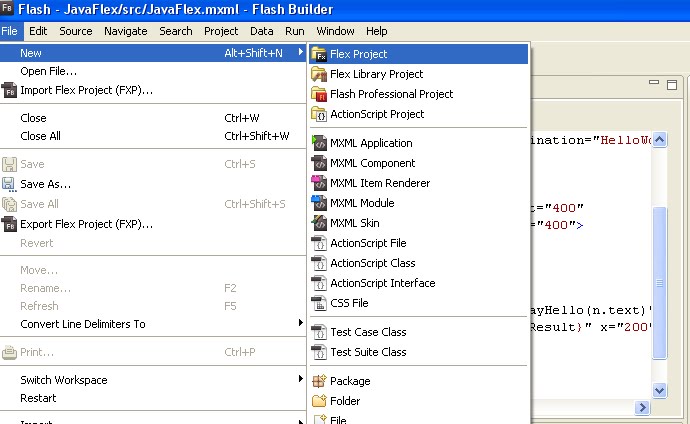
Open Flash Builder 4
File--New—Flex Project
New Flex Project window will open.
where you give project name such as AlerPro
Next—Next—Finish
AlertPro project successfully created.
Note: automatically AlertPro.mxml file created.
Step 2:
Include following coding into the AlertPro.mxml
1. Open Control Panel
2. Click the System icon then a window will pop up
3. Go to the Advanced tab
4. Click the "Environment Variables"
5. Select "New" in System Variables.
6. In the Variable Name textbox type JAVA_HOME
7. In the Variable Location textbox type the JDK directory
Running Installed Sample Applications.
1. Start Tomcat by double clicking [blazeds directory]tomcat\bin\startup.bat
2. Now, check if it works by running http://localhost:8400/ in your browser.
You will get output like below
Configure BlazeDS
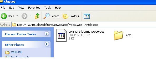
Open [blazeds directory]tomcat\webapps\
Copy the blazeds folder and change the name it as "yoga".
Open "yoga" folder.
You should be able to see 2 folders. WEB-INF and META-INF.
Inside WEB-INF, open web.xml
Remove comment < !—begin rds and remove end rds -- >
And change to false like below
….
….
< init-param >
< param-name > useAppserverSecurity < /param-name >
< param-value > false < /param-value >
< /init-param >
….
….
6. Inside the flex folder, open remoting-config.xml and add the coding.
Note: The destination and the source values are what we'll be using in flex when we create the RemoteObject tag.
Creating the HelloWorld Class
1.Create a package com.
2.Inside your Package create a HelloWorld Class. Your HelloWorld.java should look like this:
package com;
public class HelloWorld
{
public String sayHello(String name)
{
return "Hello, " + name;
}
}
3.compile the HelloWorld.java
& > javac –d . HelloWorld.java
4.you get HelloWorld.class file inside com.HelloWorld.class
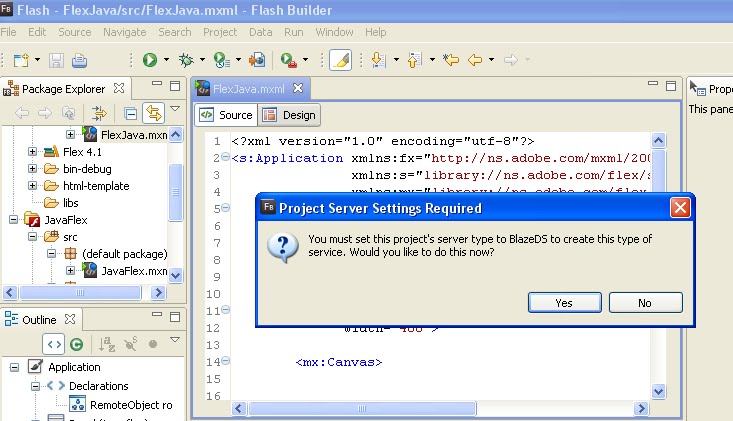
To understand how to connect Flex with java from this post.
Requirements:
1). Download BlazeDS
2). Flash Builder
3). Jdk(above 1.5)
Procedure:
Step 1:
Setting up Environment Variable in Windows
1. Open Control Panel
2. Click the System icon then a window will pop up
3. Go to the Advanced tab
4. Click the "Environment Variables"
5. Select "New" in System Variables.
6. In the Variable Name textbox type JAVA_HOME
7. In the Variable Location textbox type the JDK directory
Some properties are common to all UI Flex Components.
Properties:
1). color=”specify any color “ -Color of text in the component, one way is like GREEN, YELLOW, RED and another way is #2211FF, #AABBCC
2). fontSize=”Specify pixel” -Height of the text, in pixels. You give any number.
3). fontStyle=Determines whether the text is italic font. Recognized values are "normal" and "italic".
4). fontWeight=Determines whether the text is boldface. Recognized values are normal and bold. The default value for Button controls is bold. The default value for all other controls is normal.
To understand the properties of the Label and TextInput UI Components.
Label Properties:
Label Properties
Id=”String” ID of the component. This value becomes the instance name of the object and should not contain any white space or special characters. Each component throughout an application should have a unique id.
Text=”string” Specifies the plain text displayed by this control. Its appearance is determined by the CSS styles of this Label control.
Color=”color” Color of text in the component
FontFamily=”String” Name of the font to use. Unlike in a full CSS implementation, comma-separated lists are not supported. You can use any font family name. If you specify a generic font name, it is converted to an appropriate device font. The default font for the Halo theme is "Verdana". The default font for the Spark theme is "Arial".
FontSize=”Number” Height of the text, in pixels. In the Halo theme, the default value is 10 for all controls except the ColorPicker control. For the Halo themed ColorPicker control, the default value is 11. In the Spark theme, the default value is 12 for all controls except the ColorPicker control. For the Spark themed ColorPicker control, the default value is 11.
FontStyle=”String” Determines whether the text is italic font. Recognized values are "normal" and "italic".
FontWeight=”String” Determines whether the text is boldface. Recognized values are normal and bold. The default value for Button controls is bold. The default value for all other controls is normal.
TextAlign=”String” Alignment of text within a container. Possible values are "left", "right", or "center".
The default value for most components is "left". For the FormItem component, the default value is "right". For the Button, LinkButton, and AccordionHeader components, the default value is "center", and this property is only recognized when the labelPlacement property is set to "left" or "right". If labelPlacement is set to "top" or "bottom", the text and any icon are centered.
TextDecoration=”String” Determines whether the text is underlined. Possible values are "none" and "underline".
Tooltip=”string” Text to display in the ToolTip.
TextInput properties
Id=”String”ID of the component. This value becomes the instance name of the object and should not contain any white space or special characters. Each component throughout an application should have a unique id.
BorderColot=”color” Color of the border
BorderVisible=”Boolean” Visibility of the border.
Color=”color” Color of text in the component
DisplayAsPassword=”Boolean” Indicates whether this control is used for entering passwords. If true, the field does not display entered text, instead, each text character entered into the control appears as the character "*".
Visible=”Boolean” Whether or not the display object is visible. Display objects that are not visible are disabled. For example, if visible=false for an InteractiveObject instance, it cannot be clicked.
When setting to true, the object dispatches a show event. When setting to false, the object dispatches a hide event. In either case the children of the object does not emit a show or hide event unless the object has specifically written an implementation to do so.
Checkbox Properties
Id=”String” ID of the component.
CornerRadius=”Number” Radius of component corners. The following components support this style: Alert, Button, ComboBox, LinkButton, MenuBar,
Lable=”String” Text to appear on the Button control.
Selected=”Boolean” Indicates whether a toggle button is toggled on (true) or off (false). This property can be set only if the toggle property is set to true.


